Achieving a 3x account activation rate with Gamification
Achieving a 3x account activation rate with Gamification
Achieving a 3x account activation rate with Gamification
Achieving a 3x account activation rate with Gamification
2022
2022
2022
2022
Overview
I redesigned the experience of opening an account for Juno's crypto banking, improving both the onboarding and first-deposit (account activation) flows. This project relied heavily on research-driven design, leading to notable enhancements in Activation and Revenue.
Role
:
Sr. Product Designer
Client
:
Juno Finance
Website
:
https://juno.finance/
Timeline
:
3 months
Problem Statement
An alarming ~75% of account holders refrained from funding their checking accounts after opening the account, with almost a 50% drop-off in users at the KYC document upload step. Post-account creation, users took an average of 8 days to fund their accounts for the first time.
An alarming ~75% of account holders refrained from funding their checking accounts after opening the account, with almost a 50% drop-off in users at the KYC document upload step. Post-account creation, users took an average of 8 days to fund their accounts for the first time.
An alarming ~75% of account holders refrained from funding their checking accounts after opening the account, with almost a 50% drop-off in users at the KYC document upload step. Post-account creation, users took an average of 8 days to fund their accounts for the first time.
An alarming ~75% of account holders refrained from funding their checking accounts after opening the account, with almost a 50% drop-off in users at the KYC document upload step. Post-account creation, users took an average of 8 days to fund their accounts for the first time.
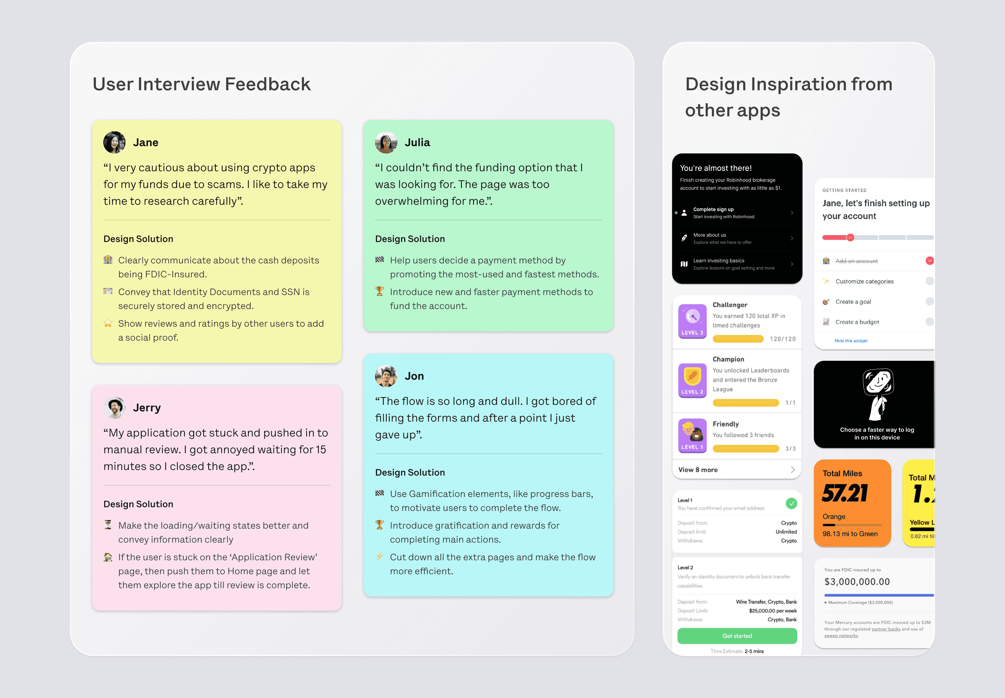
User and Market Research
We conducted numerous user interviews with individuals who began but did not complete the process to understand their reasons for abandonment. We further tested our updated flows based on the feedback and insights, with these same users.
Our market research delved into competitor FinTech and Crypto apps, like Transak and Swype, to analyze their onboarding flows. We also gathered insights from successful gamification principles found in apps such as Duolingo, Nike Run+ and other habit-building applications.
I researched about the industry standards for onboarding and activation funnels. We later created various pivot tables and graphs to extract actionable insights from user data.
I understood that we mainly had to solve for the speed and efficiency of the flow, creating a sense of trust and safety in the product and motivating the users by delighting and rewarding them.
Ideation and Journey
While I was handling the end-to-end onboarding and activation flows for both mobile and web platforms and tracking all the related metrics, other product designers focused on the acquisition by working on the landing pages, app store screenshots, and marketing material.
The first interaction users had with the app post-download was through the walkthrough screens. Previously, our website and walkthrough screens lacked a cohesive design language. Collaborating with the visual design team, we revamped our walkthrough screens to present our key features to users effectively. This also functioned as the 'logged-out' state of the app.
We streamlined the process of obtaining notification permissions, implementing this step earlier in the flow than the previous version. This enabled us to remind users if they seemed to drop off during the onboarding process.
In our previous designs, we employed toast messages upon completing minor tasks such as email verification, mobile number verification, or document uploads. These were replaced with subtle delight elements designed to encourage users as they progressed through the flow, creating a positive feedback loop. Additionally, we introduced a progress bar to the onboarding flow, offering users visibility into pending steps and their overall progress, motivating them to complete the process.
Upon studying the KYC flows of other apps, we discovered that users often preferred a more concise approach. Rather than inundating users with detailed information at each step, which frequently led to skipping, we streamlined our flow. Before, we had a lot of explanations about why we needed certain information like their address or documents. We made the process shorter by taking out extra pages of information.
Previously, we would immediately ask users for personal information without providing much context. To address this, we created a soft launch screen to introduce the account opening process.
We strategically placed trust elements and social proof in areas where we noticed a high number of drop-offs. For instance, users hesitated to input their SSN details until we highlighted our secure storage with 256-bit encryption. Additionally, we focused on improving the experience for users whose accounts received a high-risk score and were flagged for the personal information provided.

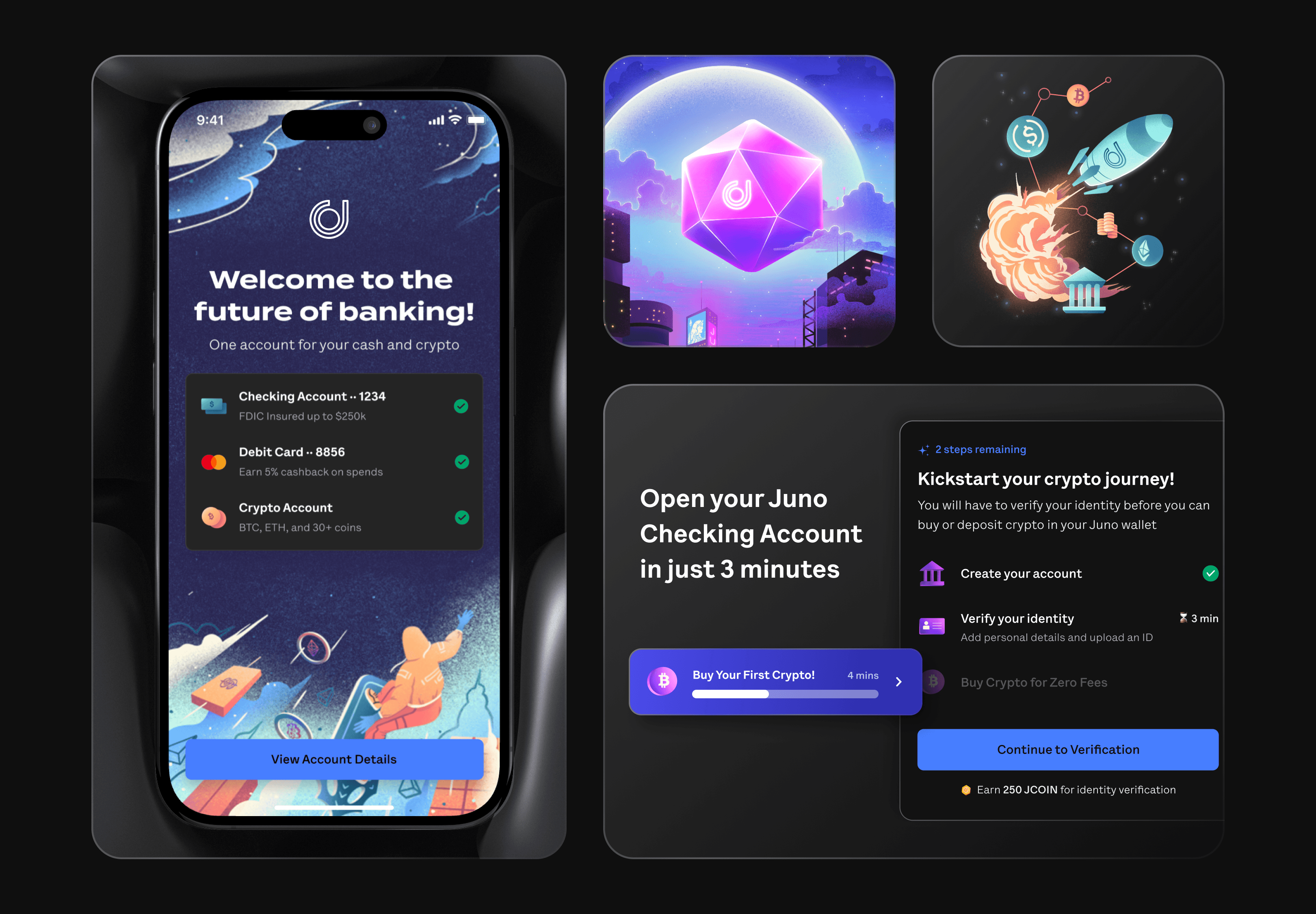
Our account verification process was swift, with users typically gaining access within 10-20 seconds of submitting their application. However, for cases where verification took longer than usual, we allowed users to explore the app till their verification was completed. This approach significantly reduced user frustration, especially for those who previously complained about extended wait times.
Collaborating closely with developers, I designed a captivating animation for the Juno account opening experience. This animation guided users through their checking account, crypto account, and debit card details. We also included a comprehensive page displaying their cash, crypto, and card limits, emphasizing the FDIC insurance for their cash through our partner bank.
To incentivize users, we introduced a reward of 250 JCOIN (Loyalty Points) for opening their account. I crafted an informative page detailing how users could make the most of these coins and earn additional rewards through in-app tasks. Following this page, users seamlessly transitioned to the app's home screen.
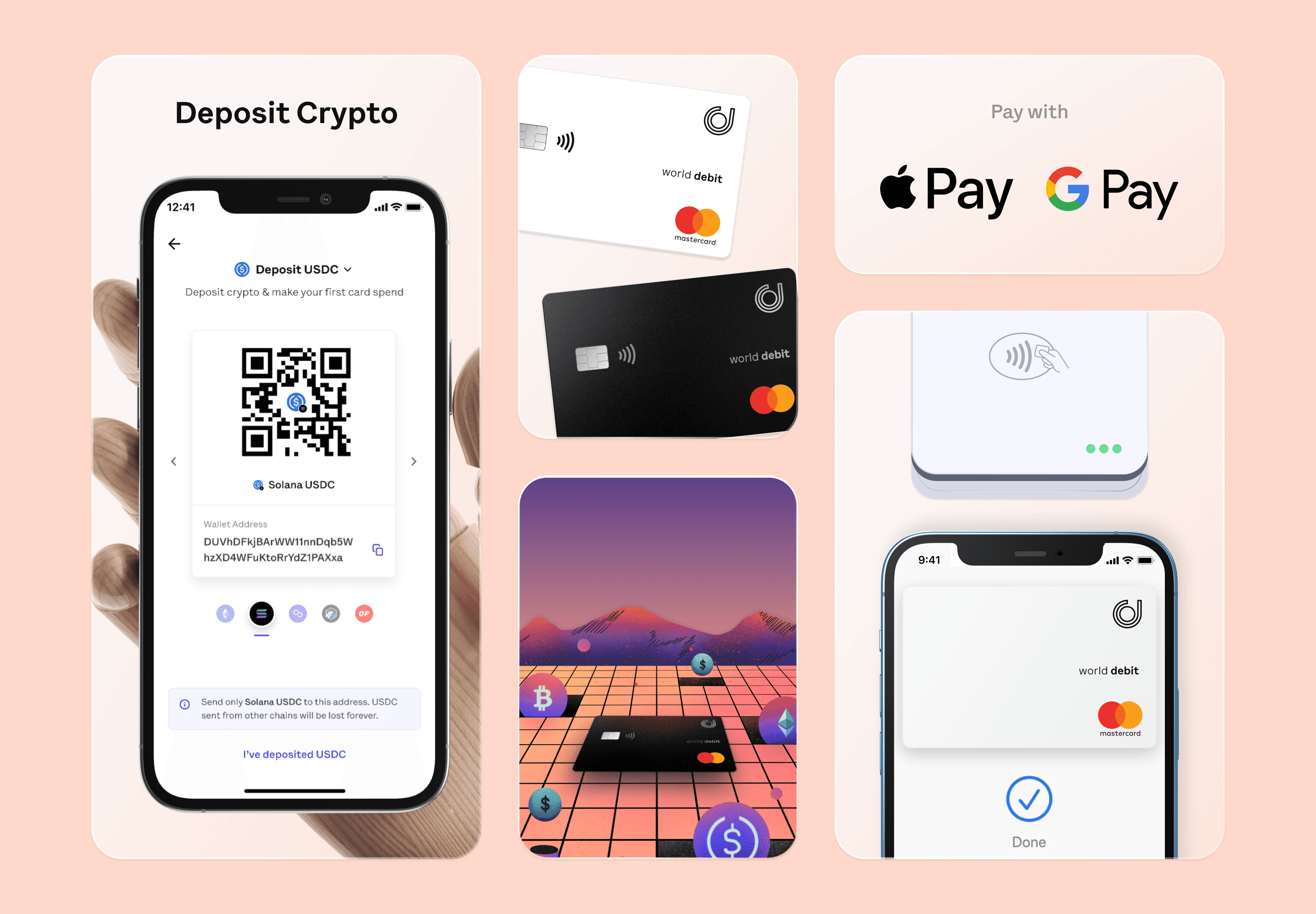
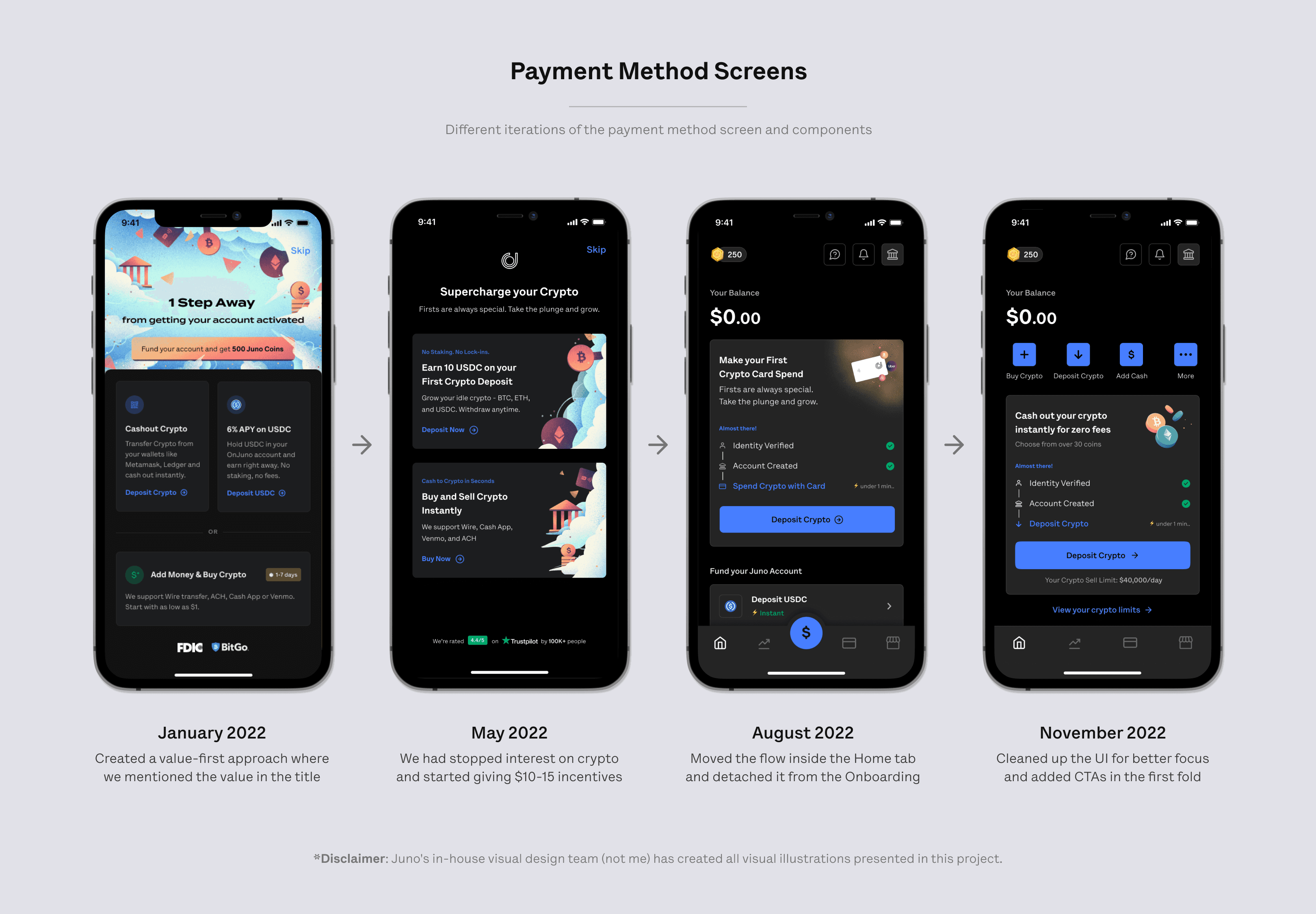
I have been involved with the payment methods, known internally as the First Deposit screen, since the app's first version. During our user discussions, we uncovered a significant insight: users preferred to explore the app and understand its workings before making any financial commitments. In previous versions, we allowed users to bypass the first deposit flow. However, this time, we decided to shift all communication regarding funding their account after they reached the home page. Through multiple design iterations and testing, we achieved remarkable results.
We experimented with various versions of the primary funding card element on the home page, conducting A/B tests with different user cohorts. One variant encouraged users to deposit crypto for trading, while another prompted them to add cash and earn a 5% APY.
Inside the app, we incorporated numerous social proof and trust elements. Addressing user FAQs, we integrated elements that linked to relevant blog posts. These additions included information about our crypto and banking partners, details on FDIC Insurance, links to our Discord community, user statistics, and ratings and reviews on Trustpilot.
Our account verification process was swift, with users typically gaining access within 10-20 seconds of submitting their application. However, for cases where verification took longer than usual, we allowed users to explore the app till their verification was completed. This approach significantly reduced user frustration, especially for those who previously complained about extended wait times.
Collaborating closely with developers, I designed a captivating animation for the Juno account opening experience. This animation guided users through their checking account, crypto account, and debit card details. We also included a comprehensive page displaying their cash, crypto, and card limits, emphasizing the FDIC insurance for their cash through our partner bank.
To incentivize users, we introduced a reward of 250 JCOIN (Loyalty Points) for opening their account. I crafted an informative page detailing how users could make the most of these coins and earn additional rewards through in-app tasks. Following this page, users seamlessly transitioned to the app's home screen.
I have been involved with the payment methods, known internally as the First Deposit screen, since the app's first version. During our user discussions, we uncovered a significant insight: users preferred to explore the app and understand its workings before making any financial commitments. In previous versions, we allowed users to bypass the first deposit flow. However, this time, we decided to shift all communication regarding funding their account after they reached the home page. Through multiple design iterations and testing, we achieved remarkable results.
We experimented with various versions of the primary funding card element on the home page, conducting A/B tests with different user cohorts. One variant encouraged users to deposit crypto for trading, while another prompted them to add cash and earn a 5% APY.
Inside the app, we incorporated numerous social proof and trust elements. Addressing user FAQs, we integrated elements that linked to relevant blog posts. These additions included information about our crypto and banking partners, details on FDIC Insurance, links to our Discord community, user statistics, and ratings and reviews on Trustpilot.
The product and design teams collaborated on the idea of fully opening the app to users. This would allow them to experience the app in its entirety, view all available cryptocurrencies, explore different payment methods for transferring cash, check different debit cards available, and learn about cashback brands—essentially providing a comprehensive feel of the app before sharing any personal information or documents.
While we had explored this concept from a design perspective, it was not launched as a product due to other prioritized initiatives.
Final Prototype
Click here ↗ to interact with the Figma prototype to experience the onboarding and activation flow
Click here ↗ to interact with the Figma prototype to experience the onboarding and activation flow
Click here ↗ to interact with the Figma prototype to experience the onboarding and activation flow
Click here ↗ to interact with the Figma prototype to experience the onboarding and activation flow

Implementation
In terms of roles:
I was the sole product designer on this project. Two talented in-house visual designers, Trina and Anisha, made the illustrations.
I collaborated directly with the Chief Product Officer, Swam, to revamp the flows.
I worked directly with one or two developers from each web, iOS, and Android team.
We followed an iterative approach, revisiting our flows through multiple user testing sessions. We also completed many design reviews to polish how developers implemented design before launching it to our users.
Result and Impact
We not only met our KPI objectives but also decreased our expenses significantly through the power of design enhancements alone. Despite the prevailing 'Fear and Distress' in the crypto market due to FTX shutdowns, Wyre (our liquidity provider) facing insolvency, and central banks such as Silicon Valley Bank attracting unfavorable attention, we successfully elevated our funnels and business metrics.
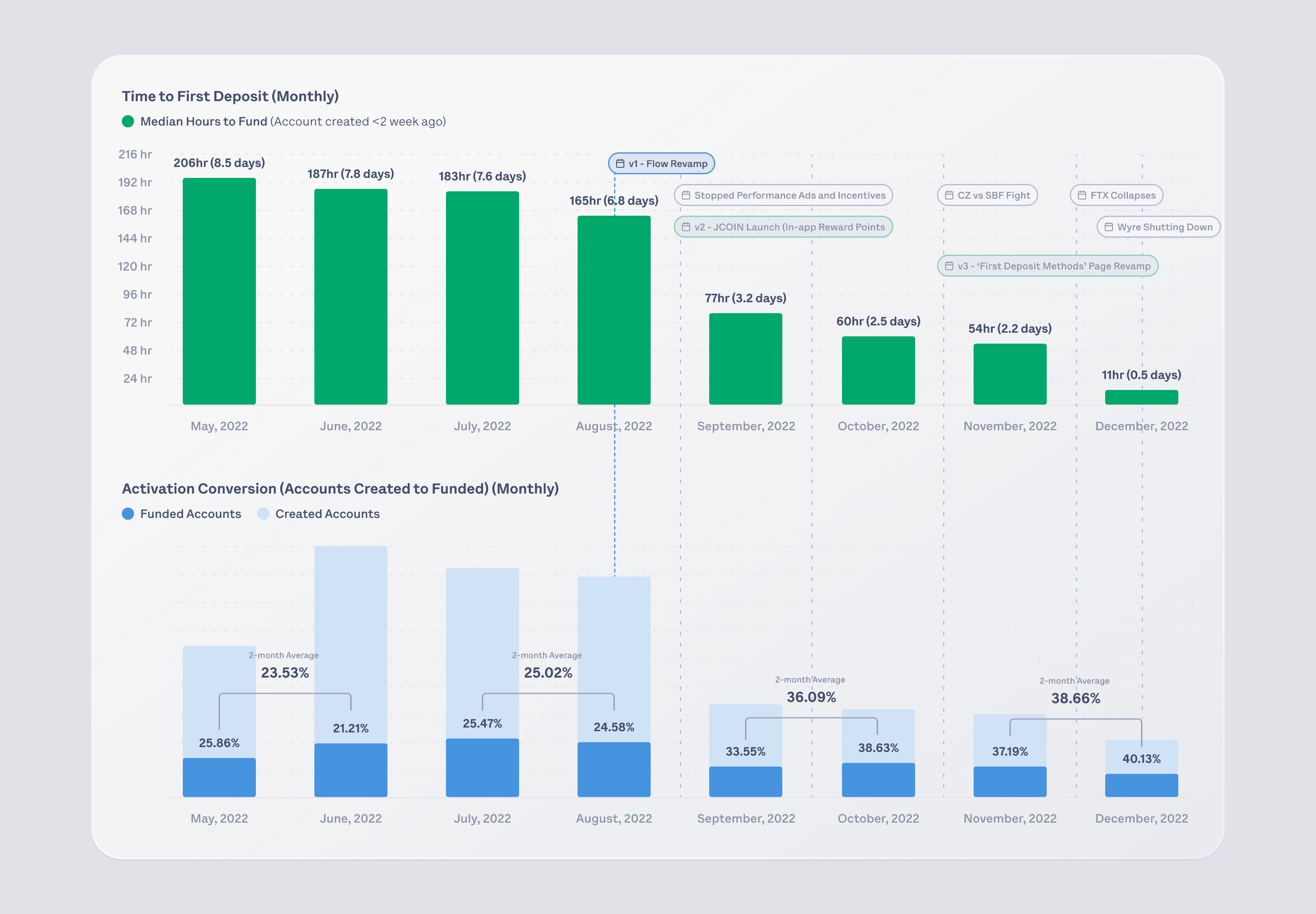
Before the 'Onboarding and Activation' flow redesign project, our 'Time to First Deposit' stood at a median of 7-8 days. My KPI was to reduce this to below 2 days. Within 30 days of the launch, we consistently achieved a median time of around 2 days. After incorporating new payment methods by December, we reached an impressive half-day median time.
In September 2022, coinciding with the launch of these design enhancements, we strategically decided to halt performance marketing and advertisements. Despite concerns that our activation percentage might decline below the ~25% mark without ads, we surpassed expectations. We achieved a 15% increase in activation, exceeding our KPI and industry standards for a crypto FinTech company. By December 2022, we achieved an outstanding 40% activation rate.
The company's decision to stop the $15 incentive for funding accounts didn't lead to a decline in activation rates. Instead, we observed a rise in activation percentages through our design efforts, resulting in a cost-saving of approximately $10,000 monthly. At the end of September 2022, we started offering Loyalty Points, known as Juno Coins (JCOIN), for opening and funding accounts, further boosting activation rates. Additionally, our December 2022 revamp of the funding methods page, promoting quicker funding options like Crypto Deposits and Card Funding, improved activation percentage.
We not only met our KPI objectives but also decreased our expenses significantly through the power of design enhancements alone. Despite the prevailing 'Fear and Distress' in the crypto market due to FTX shutdowns, Wyre (our liquidity provider) facing insolvency, and central banks such as Silicon Valley Bank attracting unfavorable attention, we successfully elevated our funnels and business metrics.
Before the 'Onboarding and Activation' flow redesign project, our 'Time to First Deposit' stood at a median of 7-8 days. My KPI was to reduce this to below 2 days. Within 30 days of the launch, we consistently achieved a median time of around 2 days. After incorporating new payment methods by December, we reached an impressive half-day median time.
In September 2022, coinciding with the launch of these design enhancements, we strategically decided to halt performance marketing and advertisements. Despite concerns that our activation percentage might decline below the ~25% mark without ads, we surpassed expectations. We achieved a 15% increase in activation, exceeding our KPI and industry standards for a crypto FinTech company. By December 2022, we achieved an outstanding 40% activation rate.
The company's decision to stop the $15 incentive for funding accounts didn't lead to a decline in activation rates. Instead, we observed a rise in activation percentages through our design efforts, resulting in a cost-saving of approximately $10,000 monthly. At the end of September 2022, we started offering Loyalty Points, known as Juno Coins (JCOIN), for opening and funding accounts, further boosting activation rates. Additionally, our December 2022 revamp of the funding methods page, promoting quicker funding options like Crypto Deposits and Card Funding, improved activation percentage.
Learnings
I gained valuable insights into Design Gamification, mainly focusing on accomplishment, ownership, and empowerment. Applying these principles to my designs, I successfully cultivated user trust in our platform and facilitated seamless, efficient completion of various processes.
Delving into product metrics, I closely examined user drop-off funnels and studied and optimized for the most-used funding choices. I learned about the industry standards and set ambitious product goals to reduce time-to-deposit to under a minute and achieve an activation percentage of around 40%. To meet our monthly accounts opened goal, we gave users $15 to open their accounts, but we eliminated the need for this incentive through our redesign efforts.
I acquired insights into driving user growth without relying on financial incentives, solely through the strategic redesign by understanding users’ pain points and improving user experience to evoke trust and motivation.
My central learning was that it is not always about building the next shiny new feature; sometimes, iterating over a simple flow by going in-depth and fixing user funnels is much more helpful for the company.